


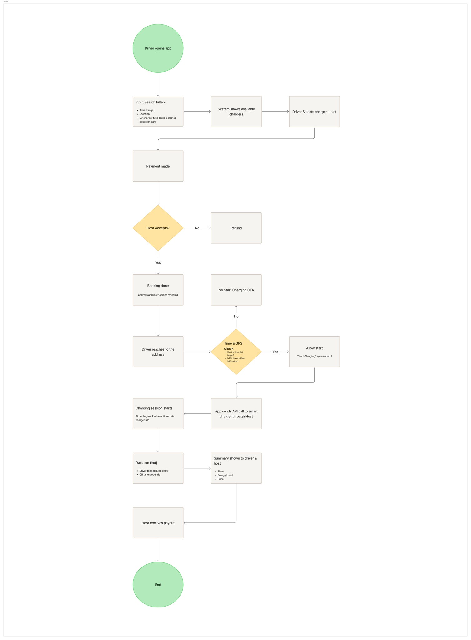
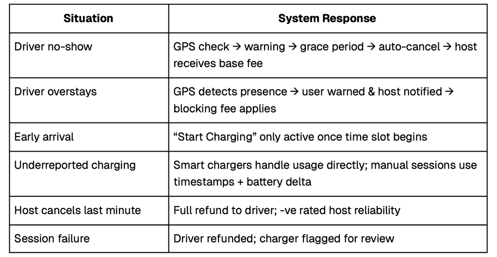
The system is designed to prevent and respond to typical abuse scenarios - protecting both driver and host.
The Search tab is the starting point for drivers. By default, it shows nearby chargers using live GPS. Once a user initiates search, it turns into a smart search with three steps - location, time, and car - each designed as collapsible segments for clarity and ease.
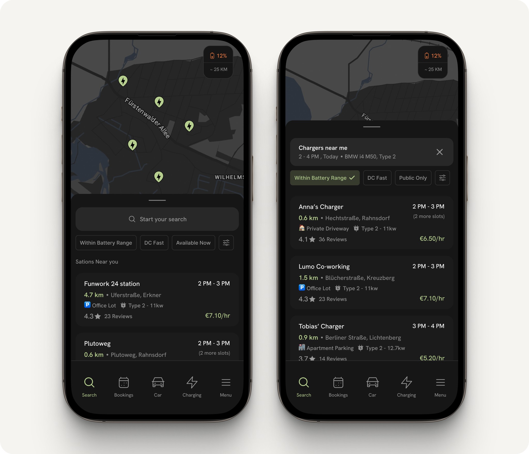
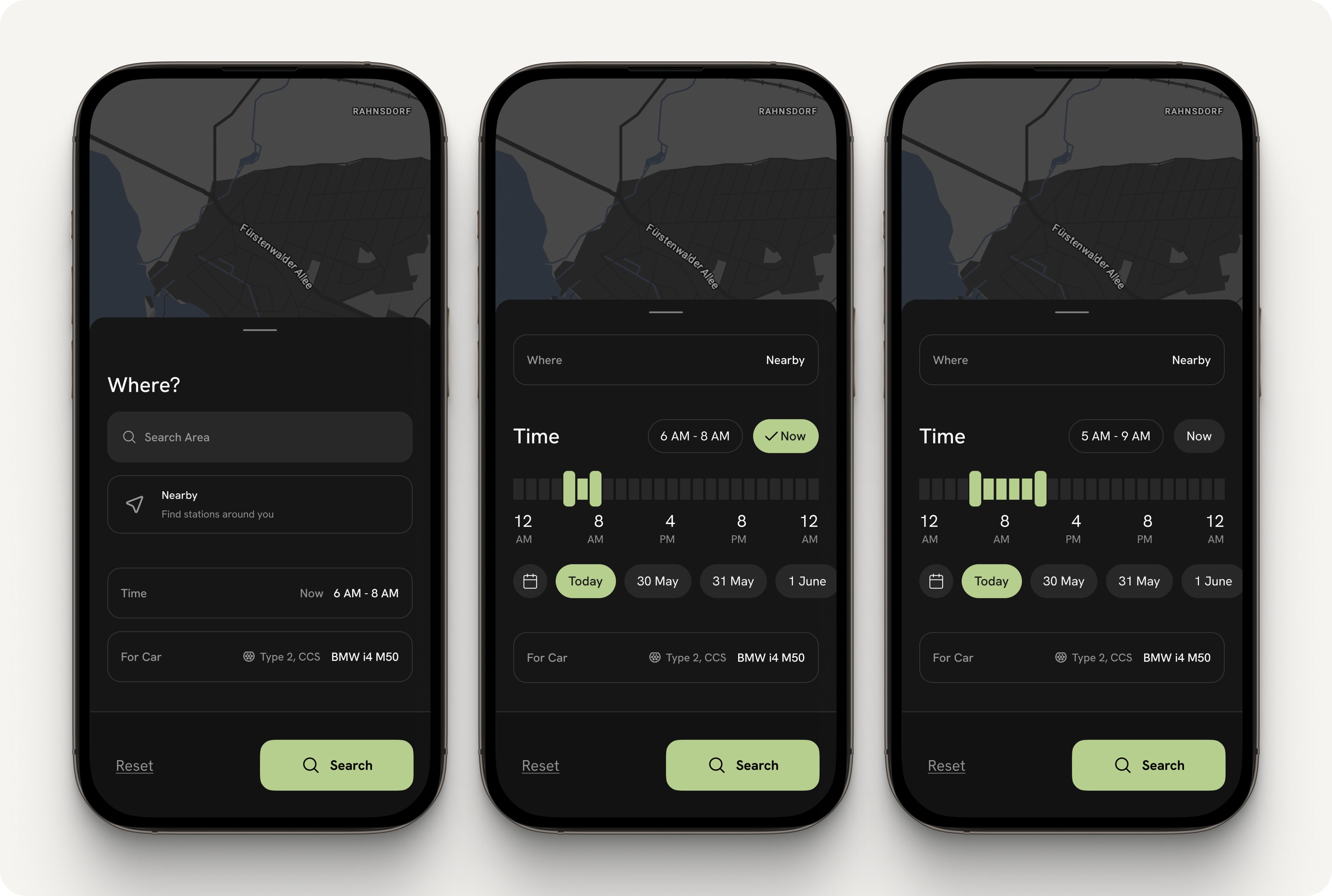
Where? Select a location or use current position to browse nearby chargers.
Time: A slider and date picker help select a time frame without needing full calendars—useful for both urgent and planned sessions.
Car: Auto-fills the compatible charger type based on the EV connected during onboarding.
Drivers can also filter for chargers “within battery range” to reduce anxiety. After booking, the selected car and driver info are sent to the host to build trust.
The results are shown in clean cards prioritizing time slot, rate, and distance—just what’s needed at a glance.
Tapping on a charger opens a detailed view with everything the driver needs to decide—designed to feel clear, informative, and not overwhelming.
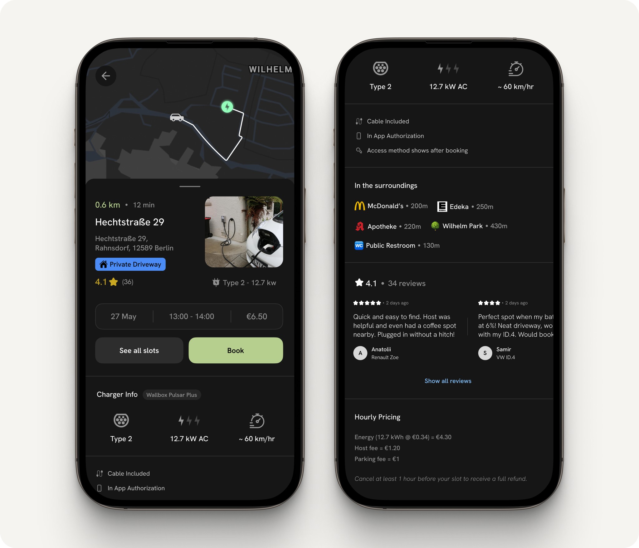
Route Preview: A mini map shows the estimated drive to the charger, giving the driver an immediate sense of distance and direction.
Quick Overview: Key details like charger name, area, distance, type, and location category are grouped up top for instant clarity.
Slot & Price Info: Shows the selected or next available time slot, date, and total cost with a clear Book CTA. A secondary option lets users browse other slots, each indicating chances of approval.
Charger Specs: Includes brand, connector type, power output, and range gained per hour - so the user knows it’s compatible.
Trust Markers: Shows things like “Cable included,” “In-app authorization,” and “Access instructions shown after booking” to build user confidence, especially for first-time bookings.
Nearby Amenities: Lists actual spots like “McDonald’s - 200m,” helping drivers plan their wait.
User Reviews: Adds social proof with recent feedback from other drivers.
Transparent Pricing: A breakdown of energy cost, host fee, and parking fee explains exactly what you’re paying for.
Cancellation Policy: A short line reminds users that cancellations are possible with refund conditions.
Once a driver selects a charger, the app takes them through a clear, step-by-step booking experience. Each screen is designed to show only what’s needed at that moment by keeping it clean and easy to follow.
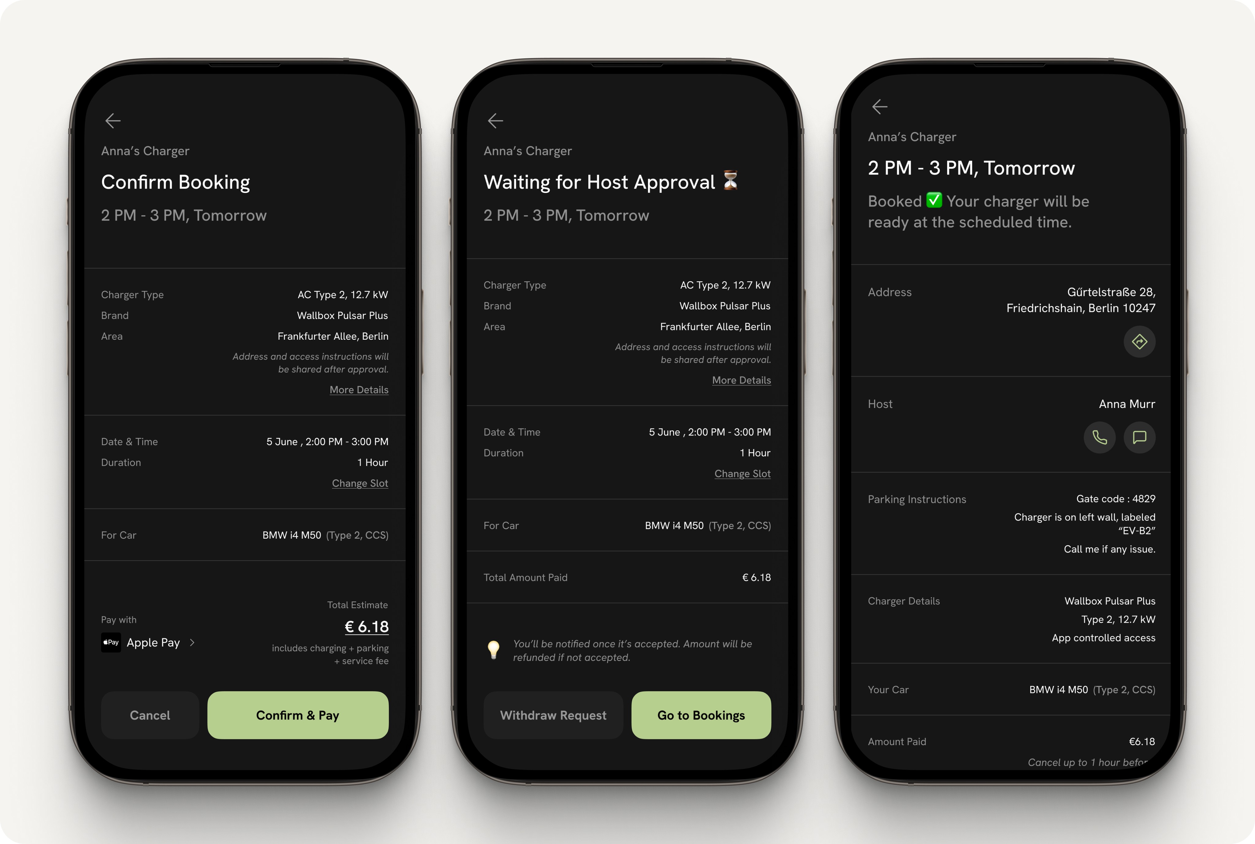
Review & Confirm
Before paying, the user sees a quick overview of the charger, time slot, estimated cost, and their connected EV. This lets them double-check everything before booking, reducing chances of error and making the process feel more secure.
Pending Approval
If the host has set bookings to manual approval, the next screen shows that the request is waiting to be confirmed. It includes all the booking details and a clear “Withdraw Request” option, along with a note that the full amount will be refunded if the booking gets declined. This gives the user peace of mind and keeps the experience transparent.
Approved Booking
Once approved either automatically or by the host - the app reveals the full address and access instructions. A map button allows the user to open directions in Google or Apple Maps, and host contact options are shown with a verified badge. A short note also explains when the “Start Charging” button will appear in the Charging tab, so users know what to expect.
These transitions are key moments in the user experience. Clear feedback, status updates, and fallback options help drivers stay informed and confident—while also reducing confusion or no-shows. And if they close the app midway, the same status is always accessible from the Bookings tab.
Once a driver has made a booking, sessions are neatly organized under the Bookings tab, split into Pending and Approved sections for clarity. Bookings that have been paid for but not yet approved by the host appear in Pending, with the option to easily Withdraw Request. Once confirmed, the booking moves to Approved, showing the confirmed location, host details, and access instructions.
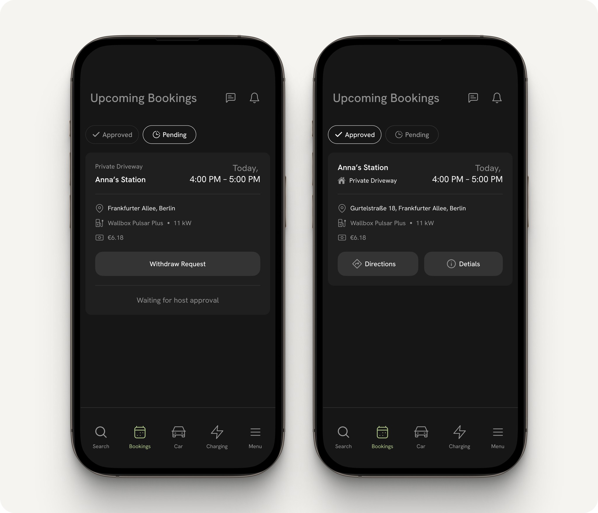
Each booking card shows key details at a glance - time, location, and car - with primary actions like Directions and Details. This helps the driver stay oriented without needing to dig deep.
The flow is also built to support task resumption, if the app is closed mid-process, users can return at any time to this tab and continue from where they left off. This reduces mental load and supports continuity, especially during time-sensitive moments.
The Charging tab acts as a dedicated space for tracking your active session—designed with minimal friction and maximum clarity. It keeps only the essentials upfront so that the primary CTA (Start/Stop Charging) and session progress remain in full focus.
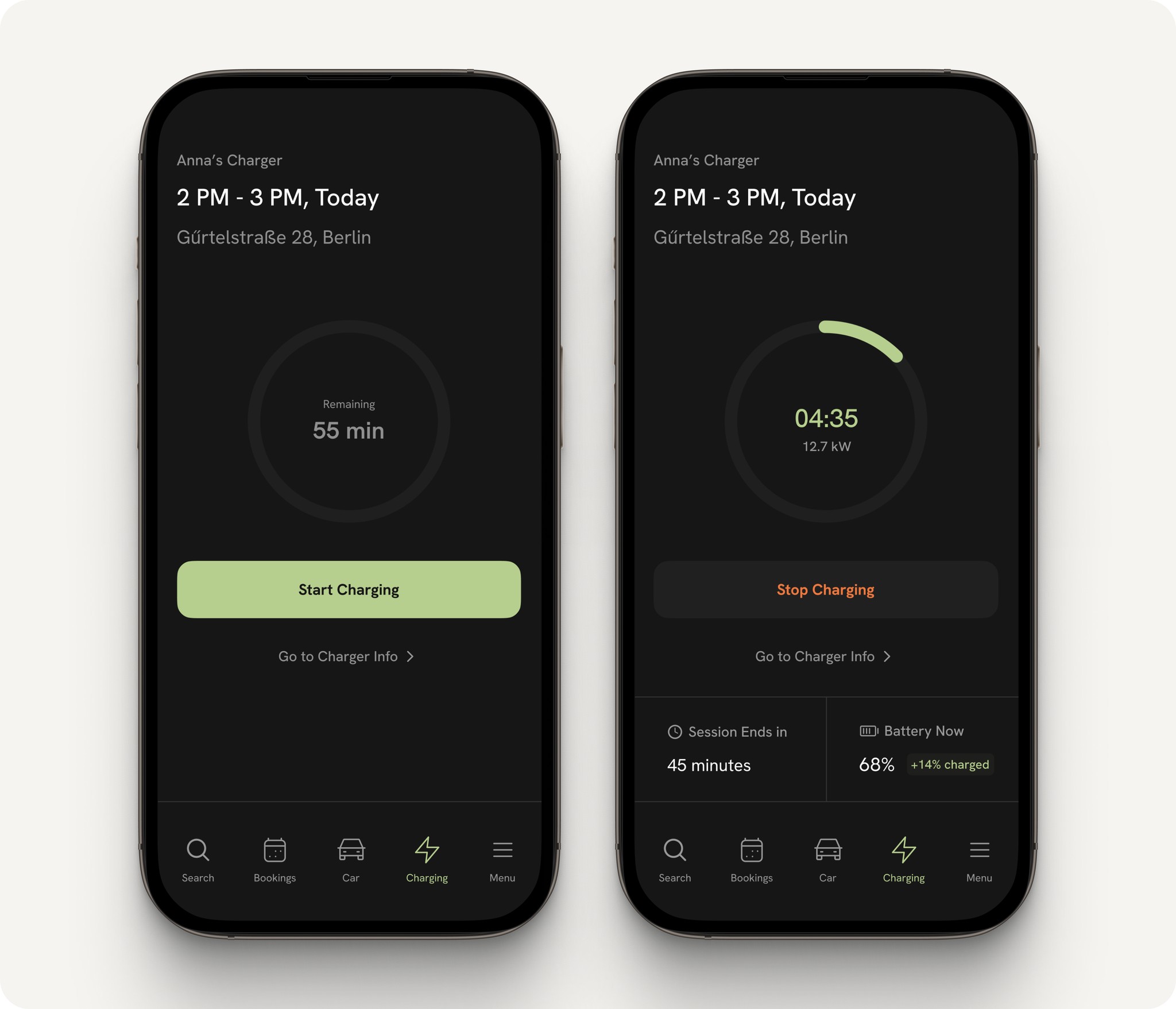
Before Charging Starts:
If the driver opens the app before arriving or before their slot begins, the Start Charging button stays hidden. Once their GPS confirms arrival within the booked time, the CTA becomes active. A progress ring shows how much time is left in the slot. This real-time logic also supports refunding any unused time if the session is started late or stopped early.
During Charging:
When charging begins, the UI transitions to a live session view showing a countdown timer visualized in a ring, aligned with the booked duration. It also includes the power output (e.g. 12.7 kW) and the EV’s live battery level, along with how much was gained during the session (via car API).
A Stop Charging CTA lets the driver end the session early, triggering the refund logic automatically. A secondary link leads back to charger info for reference.
This screen prioritizes focus and feedback, so the driver always feels in control, even when charging in a new, private environment.
Once the session ends, either naturally or stopped early by the driver - the Charging Complete screen summarizes the session: battery gained, energy delivered (e.g. 5.8 kWh), time used, and total cost calculated based on the actual duration.
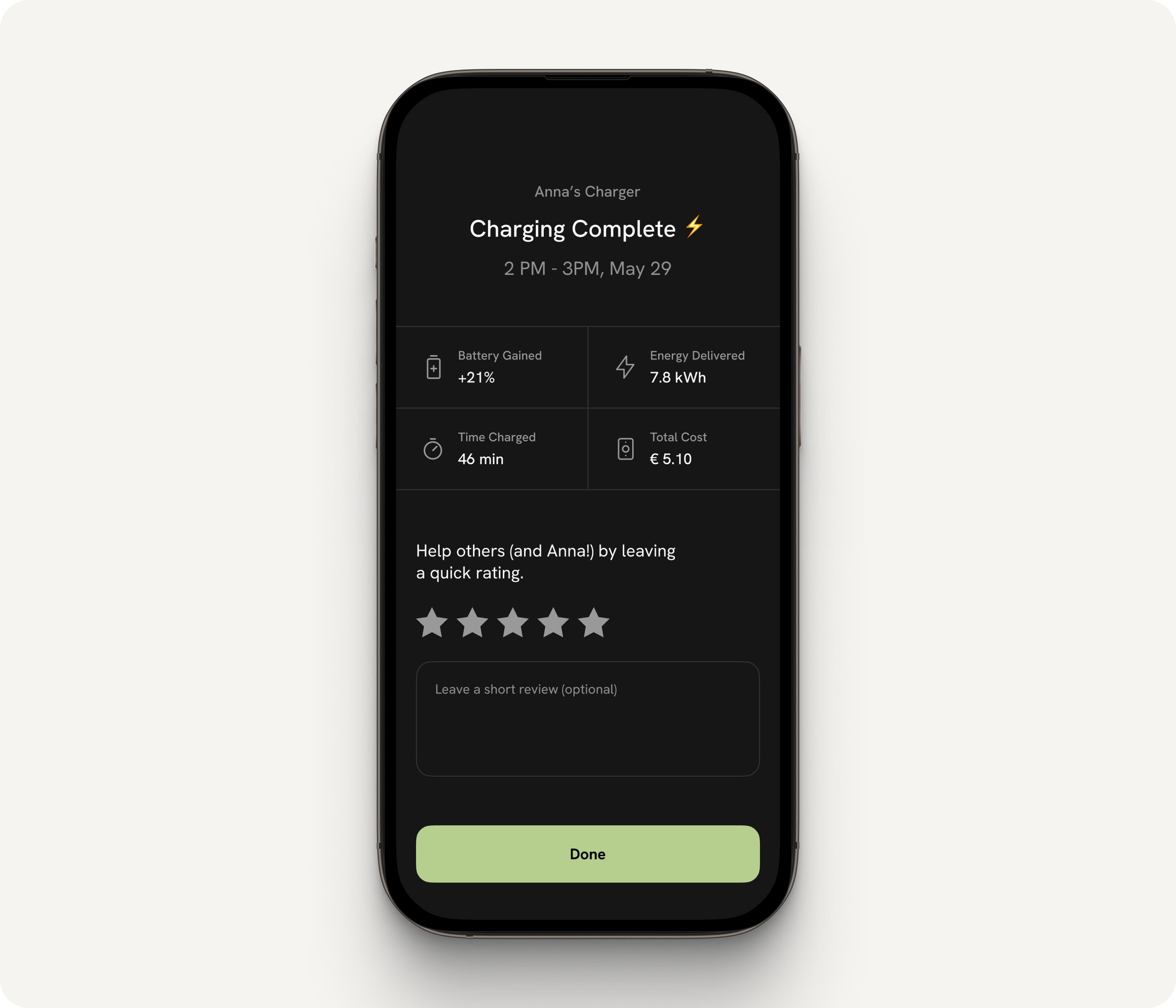
Below this summary, the driver is encouraged to leave a rating and feedback. The host’s name is mentioned directly to keep the interaction more personal. By inviting feedback at this stage, the system helps build accountability, encourages quality experiences, and strengthens community trust which is essential for sustaining a peer-to-peer platform.
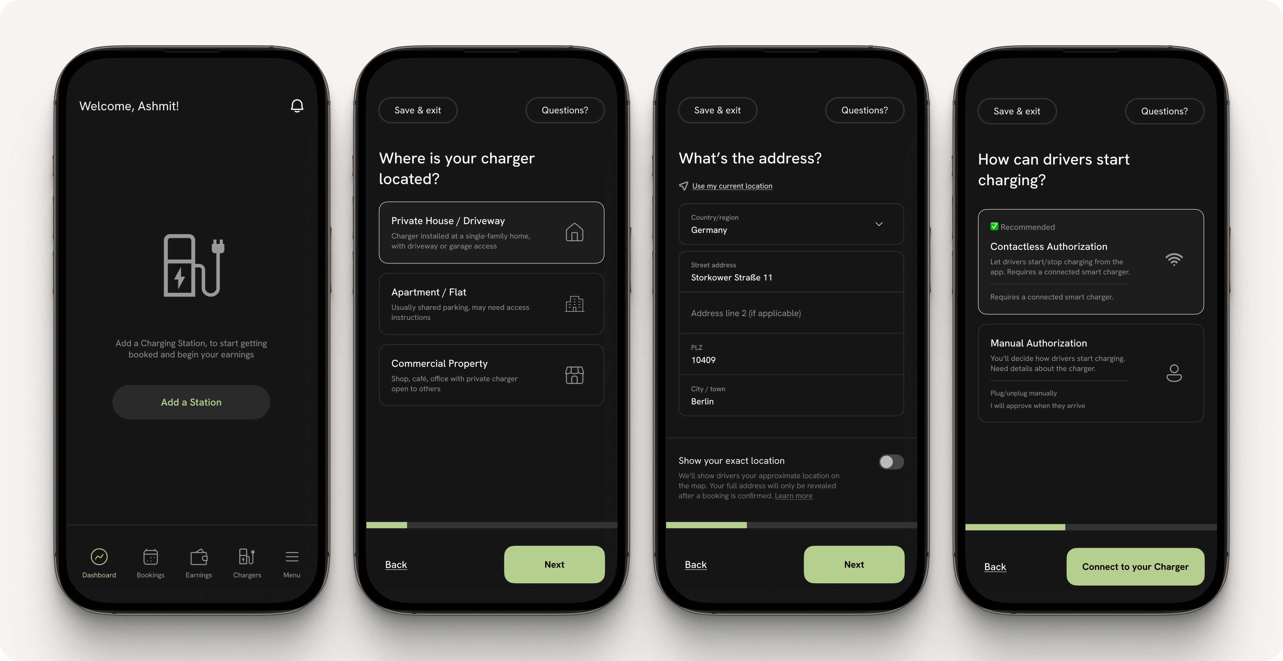
The host onboarding flow is broken down into guided steps with clear titles, short explanations, and a visual progress bar that nudges users forward. Once someone switches to the host role for the first time, they’re prompted to begin this setup process.
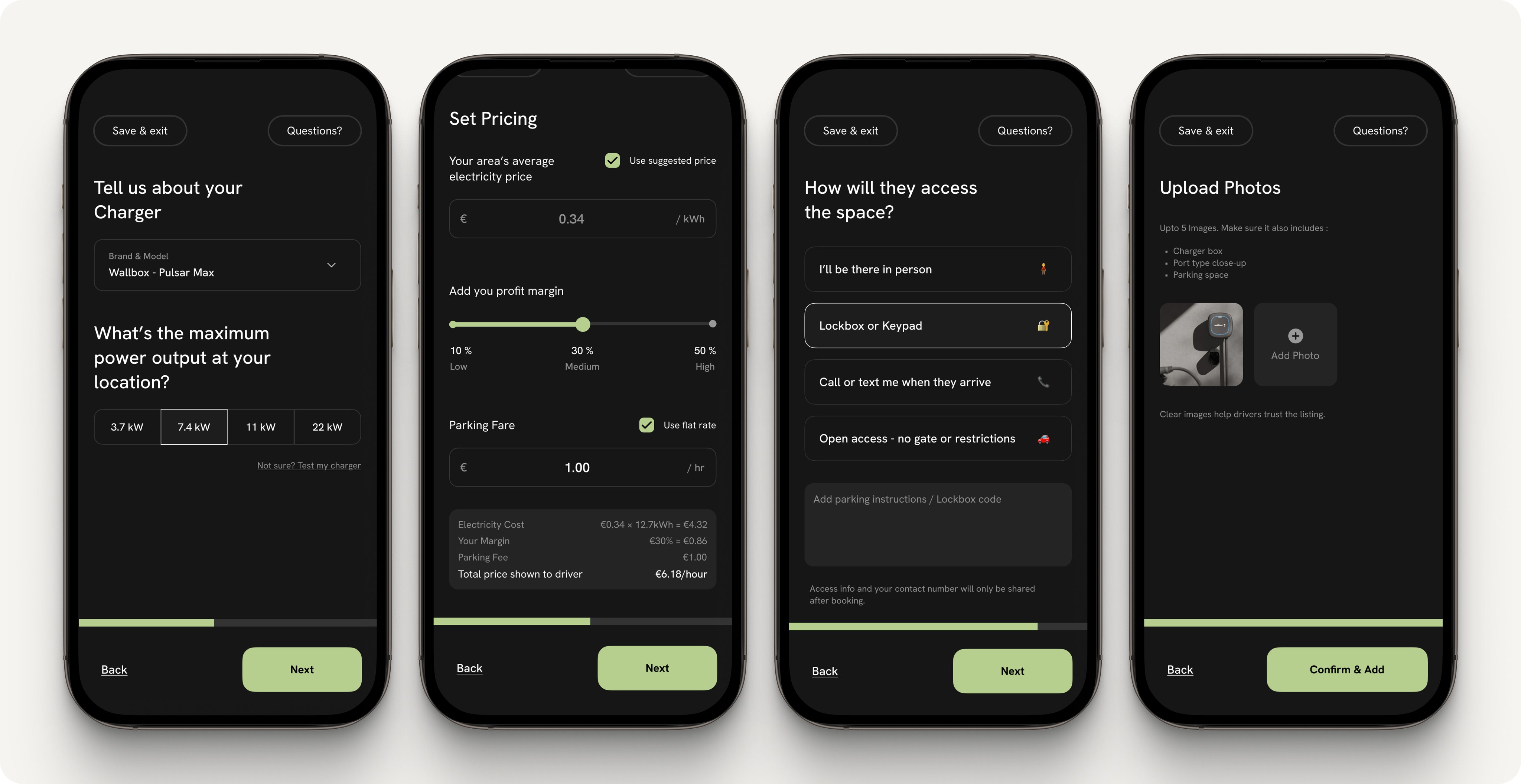
Step 4: Charger Info (only when Manual is selected)
For manual setups, hosts input the brand, connector type (like Type 2), and power output. If it’s a known charger model, many specs can autofill.
Step 5: Pricing Setup
A default energy price is shown using the local average. Hosts can tweak this and add their own margin. There’s also flexibility to set parking fees either flat or variable depending on time/day. The breakdown makes it clear what drivers will pay per hour.
Step 6: Access Instructions
Hosts explain how drivers will access the parking spot whether it’s open, gated with a code, or requires calling them. They can also leave short notes like “park next to the red bin” or “keypad code is shared after booking.”
Step 7: Upload Photos
Finally, hosts upload clear photos of the wallbox, plug, and parking spot. It’s crucial to build trust and help the driver feel confident about what to expect.
After a charger is added, hosts manage availability from the My Chargers tab. Each listed charger has its own card showing key info like charger type, access mode, and pricing and with CTAs to Edit Charger or Set Availability.
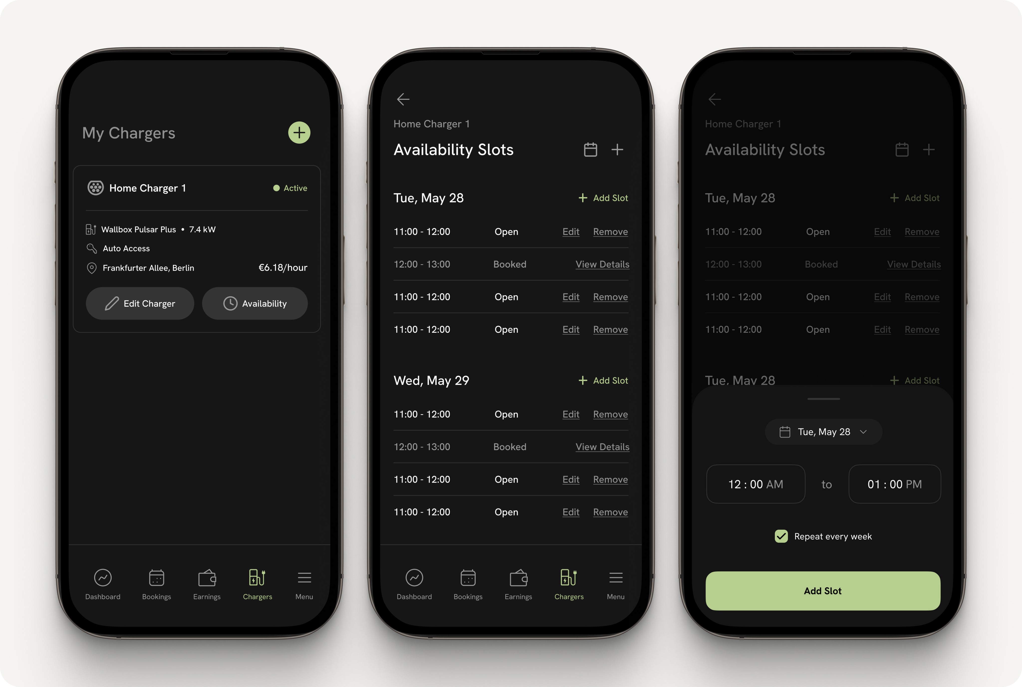
Tapping Availability opens a scrollable list of time slots, grouped by day. Each slot is labeled as Open or Booked, and hosts can easily add, remove, or modify slots.
When creating a new slot, they choose a time range and can set it to repeat weekly. If removing a recurring slot, the app smartly asks whether to remove just this week’s instance or all future ones, making it flexible for changing schedules.
The whole experience feels like a lightweight calendar, keeping scheduling quick and low-effort.
All incoming booking requests appear under the Bookings tab, segmented into Pending, Approved, and All. Hosts can switch to a calendar view for a broader overview or stay in the list view, where each request is shown in a clean card with key details such as driver name, EV model, requested time slot, and estimated earnings.
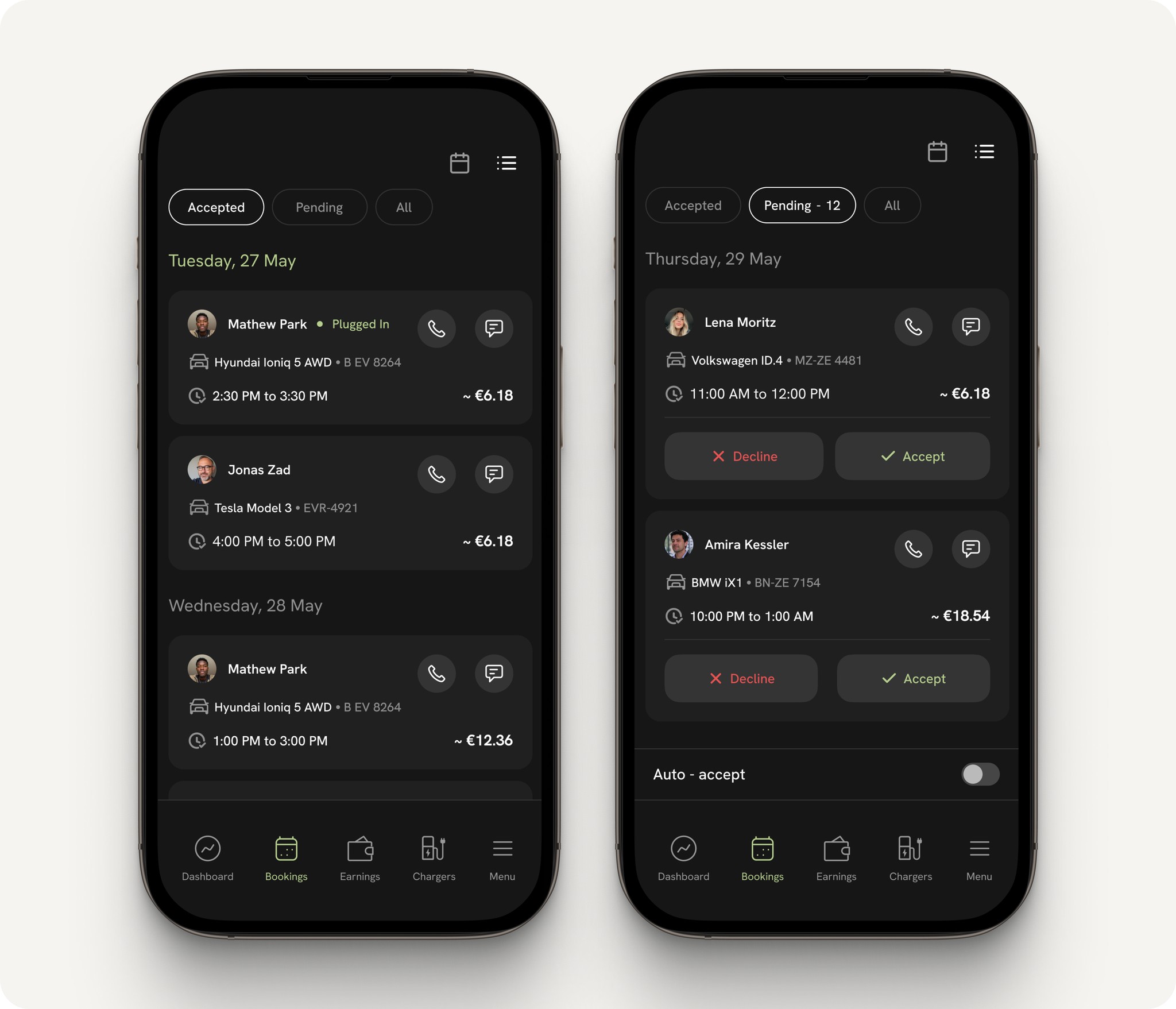
TapFrom here, hosts can approve or decline with a tap. They also have the option to view the driver’s profile or contact them directly, which is useful for any last-minute coordination, especially with manual chargers.
Once approved, bookings move to the Approved tab, where hosts can monitor upcoming sessions. Cancellations are allowed post-approval but may impact the host’s reliability rating.
The overall flow keeps booking management simple, actionable, and stress-free even for first-time hosts.
The Dashboard offers hosts a quick snapshot of their activity showing current earnings (with a link to the Earnings tab), the active session if someone is charging, and a preview of the next upcoming booking. A dedicated “View All Bookings” button provides deeper access, while a fixed CTA at the bottom connects hosts to specialized support, a globally recognized UX standard that builds trust by offering real-time help in complex systems.
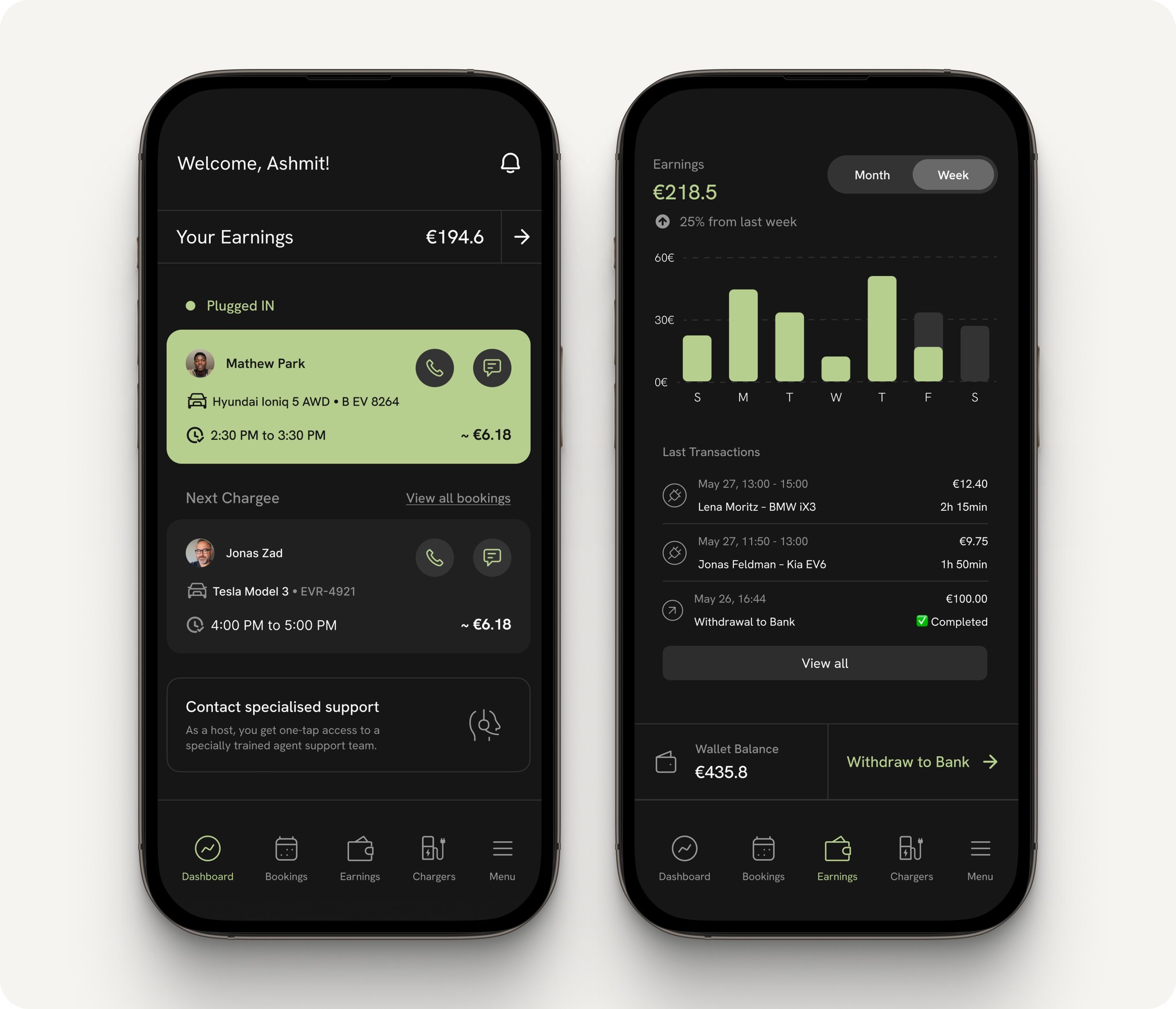
The Earnings screen makes financial progress visual and digestible. It includes:
A bar graph for daily earnings across weekly/monthly views
Current balance with percentage change from the last period
A transaction list showing session time, EV model, duration, and amount earned
A Withdraw to Bank button with current wallet balance and payout options